Chapter 8 Examining the MSE Results
Arguably the most important part of the MSE is interpreting the results and identifying a management procedure (MP) that is most suitable for the fishery.
This involves asking several questions:
- Which MPs can be excluded from the list of candidates because they perform worst than all other options?
- Which MPs are most likely to meet our management objectives?
- How do we identify the MP most suited to our fishery?
- Which data sources are most critical to the performance of the best performing MP?
8.1 Introducing Performance Metrics
To interpret the MSE results it is important that a clear set of performance metrics have been defined. Fisheries managers often have broadly defined policy goals. These conceptual objectives must be translated to quantitative operational objectives so that the MSE results can be used to evaluate performance against the specified management objectives.
For example, suppose that the fishery managers had stated broad goals to maximize yield from the fishery while minimizing the risk of the stock collapsing to unacceptably low levels. In order to use MSE to determine which MPs are most likely to meet these objectives it is neccessary to be more specific:
- What are unacceptable low stock levels? Some fraction of unfished biomass? The lowest observed historical biomass?
- What is an acceptable level of risk? What chance are we willing to tolerate that the stock will fall below that limit?
- How much yield are we willing to give up in order to increase the probability of the stock staying above unacceptably low limit?
It is important to recognize that performance metrics can vary considerably between different fisheries and management structures, but are a crucial component of the MSE and must be carefully defined before the analysis is carried out. The Performance Metrics chapter discusses this topic in more detail.
The DLMtool includes a number of commonly used performance metrics and a series of functions to summarize MP performance. The MSE results can be examined either graphically in a plot or summarized in a table. Advanced users can also develop their own plotting and summary functions (see the Custom Performance Metrics chapter for more details).
Here we briefly demonstrate some of the plotting and summary functions in DLMtool. The Examining the MSE object chapter and other chapters in that section describe the process of evaluating MSE results in more detail.
8.2 Summary Table
The summary function can be used to generate a table of MP performance with respect to a set of performance metrics:
## Calculating Performance Metrics## Performance.Metrics
## 1 Probability of not overfishing (F<FMSY) Prob. F < FMSY (Years 1 - 50)
## 2 Spawning Biomass relative to SBMSY Prob. SB > 0.5 SBMSY (Years 1 - 50)
## 3 Average Annual Variability in Yield (Years 1-50) Prob. AAVY < 20% (Years 1-50)
## 4 Average Yield relative to Reference Yield (Years 41-50) Prob. Yield > 0.5 Ref. Yield (Years 41-50)
##
##
## Performance Statistics:
## MP PNOF P50 AAVY LTY
## 1 AvC 0.42 0.56 0.94 0.48
## 2 Itarget1 0.86 0.93 0.92 0.80
## 3 matlenlim 0.97 0.99 0.09 0.60
## 4 ITe10 0.33 0.62 0.23 0.66
## 5 AvC_MLL 0.83 0.95 0.76 0.94
## 6 Itarget1_MPA 0.83 0.93 0.96 0.80
## 7 FMSYref 0.22 0.94 0.98 1.00
## 8 NFref 1.00 1.00 1.00 0.00By default the summary function includes four performance metrics, and displays the probability that:
- fishing mortality \(\left(F\right)\) is below \(F_\text{MSY}\), i.e Not Overfishing (
PNOF) - spawning biomass \(\left(\text{SB}\right)\) is above half of biomass at maximum sustainable yield \(\left(\text{SB}_{\text{MSY}}\right)\) (
P50) - average interannual variability in yield is less than 20% (
AAVY) - long-term yield (last 10 years of projection period) is above half of the maximum yield obtainable at a constant fishing rate (
LTY)
In this example we can see that probability of \(\text{SB} > 0.5\text{SB}_\text{MSY}\) for AvC is 0.56.
The performance metrics have been defined in such a way that a higher number is always better (e.g, probability of Not Overfishing rather than Overfishing where a lower probability would be more desirable).
Help documentation for the peformance metrics can be found in the usual way, for example:
The performance metrics in the summary function are completely customizable. See the Performance Metrics and Custom Performance Metrics chapters for more details.
8.3 Plotting MSE Results
DLMtool includes several functions for plotting the MSE results. You can see a list of all the plotting functions in the DLMtool for MSE objects using the plotFun function:
## DLMtool functions for plotting objects of class MSE are:## barplot COSEWIC_Dplot COSEWIC_Hplot COSEWIC_Pplot Cplot
## DFO_plot DFO_plot2 DFO_proj IOTC_plot Kplot
## NOAA_plot NOAA_plot2 plotOM Pplot Pplot2
## PWhisker Tplot Tplot_old Tplot2 Tplot2_old
## Tplot3 TradePlot TradePlot_old VOI VOI2
## VOIplot VOIplot2 wormplotHere we demonstrate a few of the plotting functions for the MSE results.
8.3.1 Trade-Off Plots
The Tplot function creates four plots that show the trade-off between the probability that the long-term expected yield is greater than half of the highest obtainable yield at a fixed F (reference yield) against the probability of:
- Not overfishing in all projection years (\(F/F_\text{MSY} < 1\))
- Spawning biomass (\(\text{SB}\)) above \(\text{SB}_\text{MSY}\) in all projection years (\(\text{SB} > \text{SB}_\text{MSY}\))
- Spawning biomass above \(0.5 \text{SB}_\text{MSY}\) (\(\text{SB} > 0.5 \text{SB}_\text{MSY}\))
- Spawning biomass above \(0.1 \text{SB}_\text{MSY}\) (\(\text{SB} > 0.1 \text{SB}_\text{MSY}\))
The Tplot function includes minimum acceptable risk thresholds indicated by the horizontal and vertical gray shading. These thresholds can be adjusted be the Lims argument to the Tplot function. See ?Tplot for more information on adjusting the risk thresholds.
MPs that fail to meet one or both of the risk thresholds for each axis are shown in italics text. The Tplot function returns a data frame showing the performance of each MP with respect to the 5 performance metrics, and whether the MP is Satisificed, i.e., if it meets the minimum performance criteria for all performance metrics.
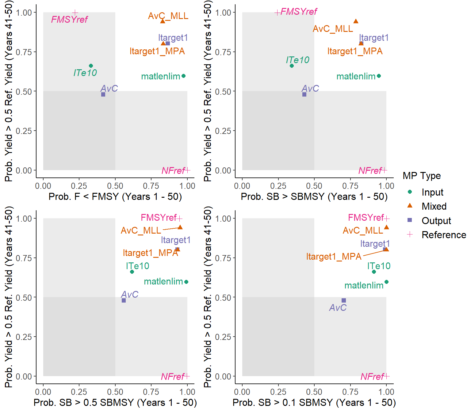
## MP PNOF LTY P100 P50 P10 Satisificed
## 1 AvC 0.42 0.48 0.43 0.56 0.70 FALSE
## 2 Itarget1 0.86 0.80 0.83 0.93 0.99 TRUE
## 3 matlenlim 0.97 0.60 0.95 0.99 1.00 TRUE
## 4 ITe10 0.33 0.66 0.34 0.62 0.91 FALSE
## 5 AvC_MLL 0.83 0.94 0.79 0.95 1.00 TRUE
## 6 Itarget1_MPA 0.83 0.80 0.82 0.93 1.00 TRUE
## 7 FMSYref 0.22 1.00 0.24 0.94 1.00 FALSE
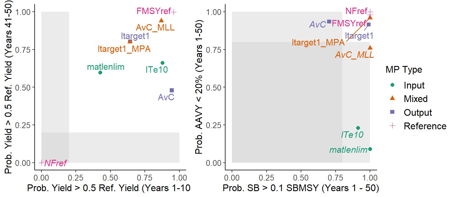
## 8 NFref 1.00 0.00 0.98 1.00 1.00 FALSEThe Tplot2 function shows the trade-off between long-term and short-term yield, and the trade-off between biomass being above \(0.1B_{MSY}\) and the expected variability in the yield:
##             MP  STY  LTY  P10 AAVY Satisificed
## 1          AvC 0.94 0.48 0.70 0.94       FALSE
## 2     Itarget1 0.64 0.80 0.99 0.92        TRUE
## 3    matlenlim 0.42 0.60 1.00 0.09       FALSE
## 4        ITe10 0.88 0.66 0.91 0.23       FALSE
## 5      AvC_MLL 0.87 0.94 1.00 0.76       FALSE
## 6 Itarget1_MPA 0.64 0.80 1.00 0.96        TRUE
## 7      FMSYref 0.96 1.00 1.00 0.98        TRUE
## 8        NFref 0.00 0.00 1.00 1.00       FALSE
The Tplot, Tplot2 and Tplot3 functions are part of a family of plotting functions that are fully customizable, and designed to work with all Performance Metrics objects. See ?Tplot and the Performance Metrics chapter for more information.
8.3.2 Wormplot
The wormplot function plots the likelihood of meeting biomass targets in future years:
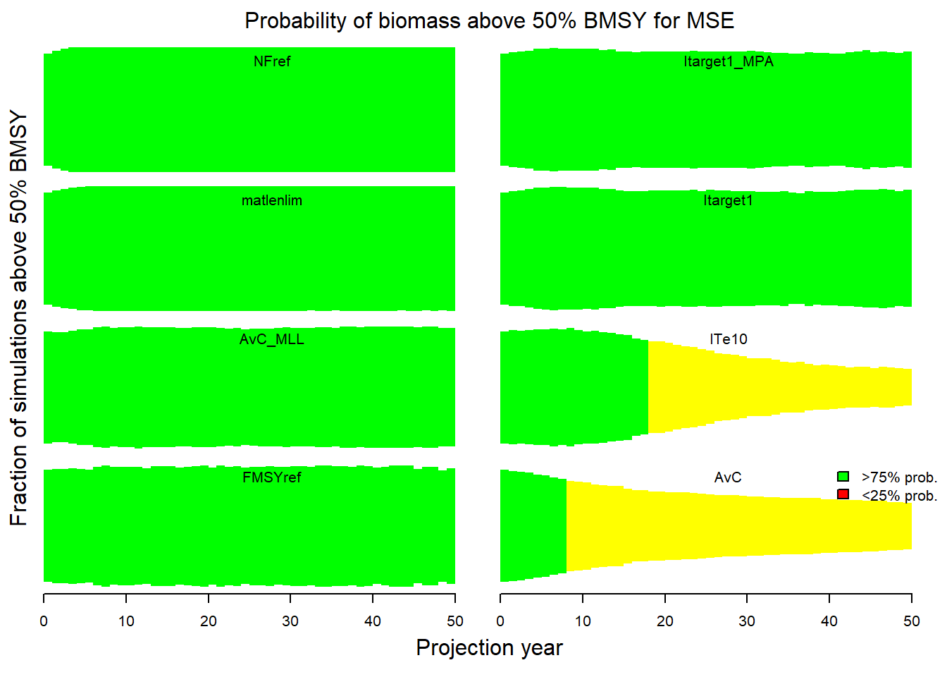
The arguments to the wormplot function allow you to choose the reference level for the biomass relative to \(B_{MSY}\), as well as the upper and lower bounds of the colored bands.
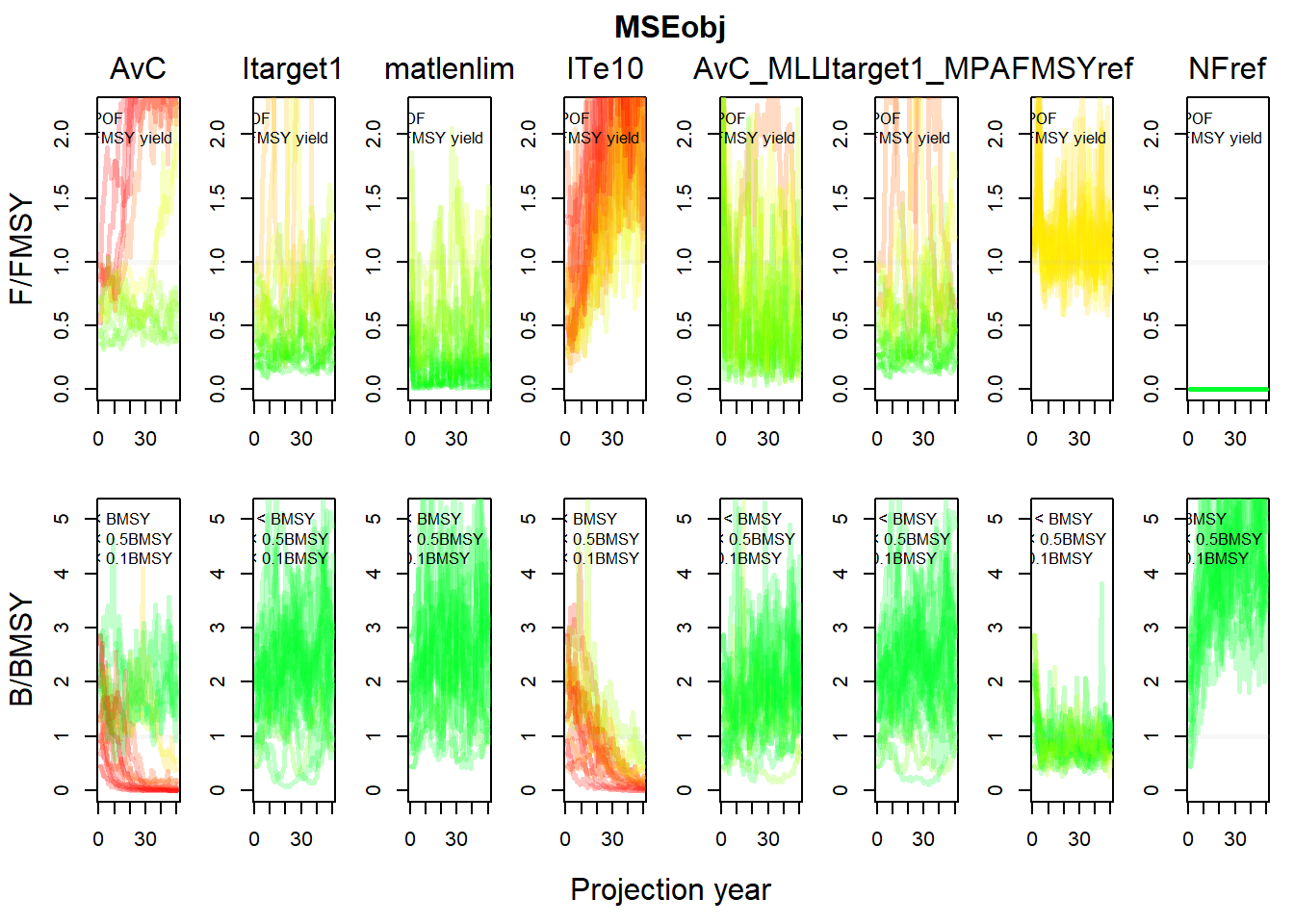
8.3.3 Projection Plots
The Pplot function plots the trajectories of biomass, fishing mortality, and relative yield for the Management Procedures.
By default, the Pplot function shows the individual trajectories of \(B/B_{MSY}\) and \(F/F_{MSY}\) for each simulation:
The Pplot2 function has several additional arguments. The YVar argument can be used to specify additional variables of interest. For example, here we have included the projections of yield relative to the long-term optimum yield:
## MSE object has more than 6 MPs. Plotting the first 6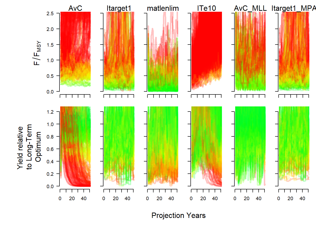
The traj argument can be used to summarize the projections into quantiles. Here we show the 20th and 80th percentiles of the distributions (the median (50th percentile) is included by default):
## MSE object has more than 6 MPs. Plotting the first 6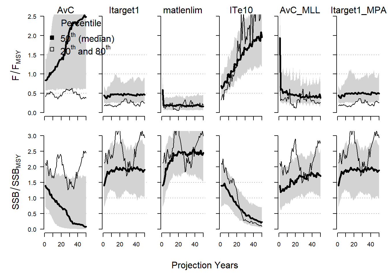
Details on additional controls for the Pplot and Pplot2 functions can be found in the help documentation associated with this function.
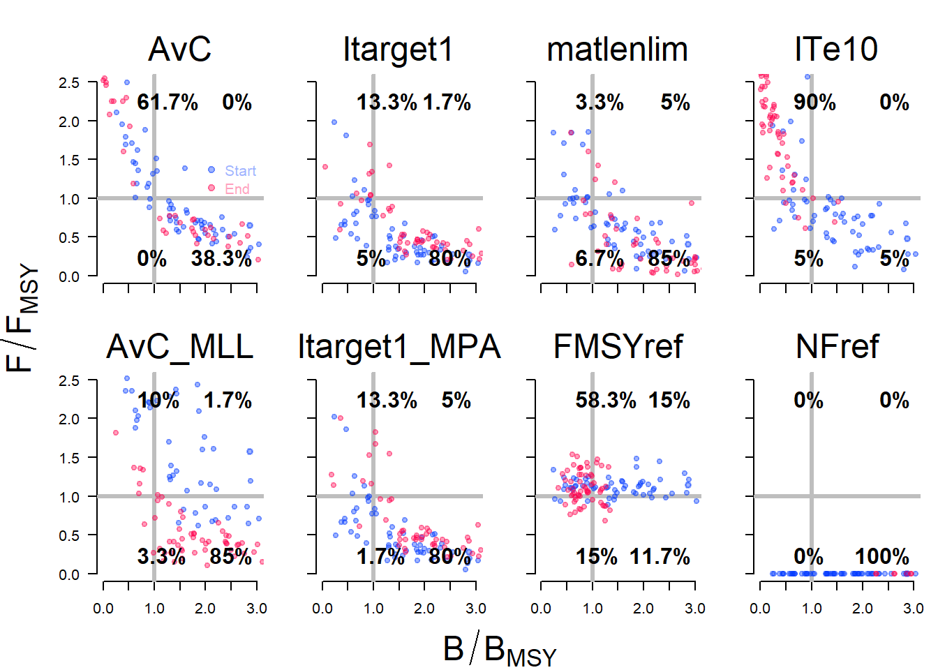
8.3.4 Kobe Plots
Kobe plots are often used in stock assessment and MSE to examine the proportion of time the stock spends in different states. A Kobe plot of the MSE results can be produced with the Kplot function: